
Digital screentones and halftones for manga and comics
Screentones carry light, mood and depth on a black-and-white page. Kathaka Studio treats them as print material, not as a filter: you see dots at the size they will print, and the export keeps them crisp.
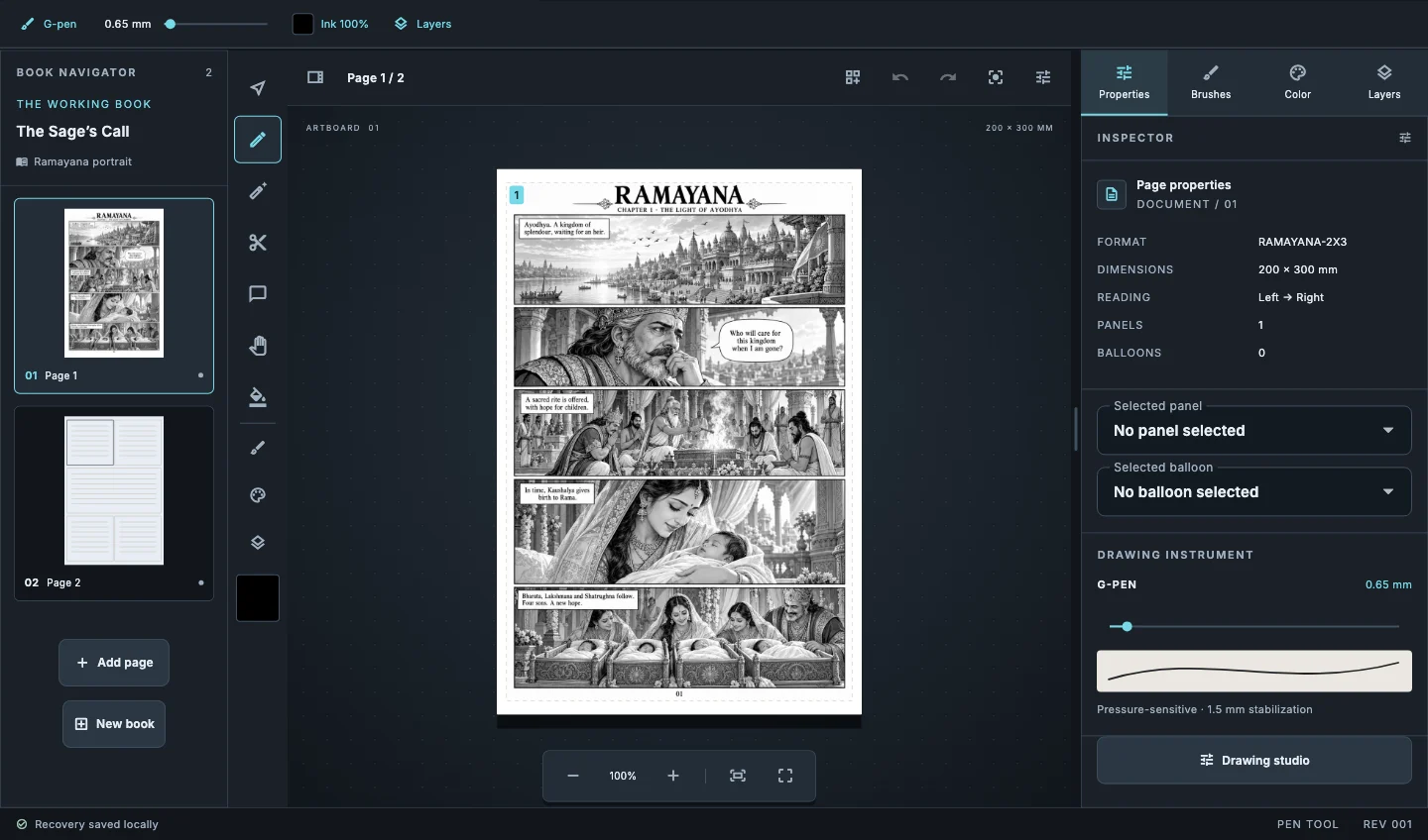
Flat and gradient tones per panel
Give a sky a vertical gradient tone and a shadow a flat one, panel by panel, with a single drag for tone gradients.
Dot preview at print size
Preview dots at the real lines per inch so you catch muddy tones before the printer does.
Fills that respect the ink
Gap-aware fills and the magic wand stop at line art on a reference layer, so tone stays inside the shapes.
1-bit export that keeps dots clean
Export 1-bit pages at 300 to 2400 dpi. Screentones stay crisp dots, and preflight warns when soft greys or colour would turn solid or vanish.
How it works
- Set the book to 600 dpi for black-and-white print before you tone.
- Select an area with the magic wand or Select object.
- Lay a flat or gradient screentone into the selection.
- Scratch highlights out with a hard eraser and run preflight before export.
Common questions
How do I avoid moiré?+
Keep tone angles consistent across a page and export at the resolution your printer asks for. Two tones at slightly different angles are what make moiré.
Can I use greys instead of dots?+
Yes, for greyscale print and screens. For 1-bit print, convert greys to screentones first; preflight tells you which pages need it.
Do tones work in colour books?+
Yes. Tone layers sit in the layer stack with paint and colour layers.
Related guides
Download Kathaka Studio
Sign in online at startup. Private drawing continues if your connection drops.